Time-polar plot
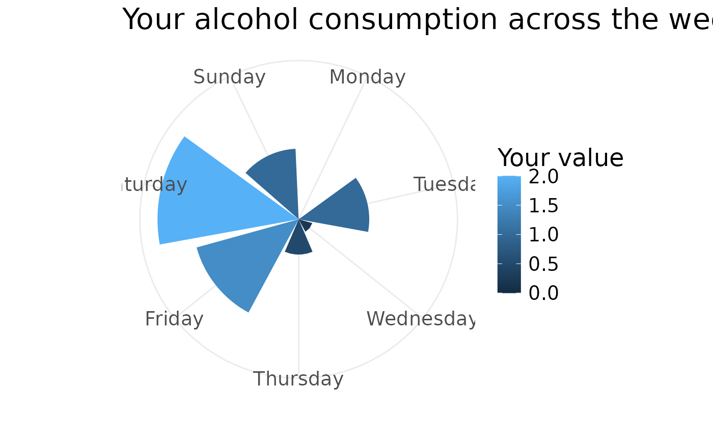
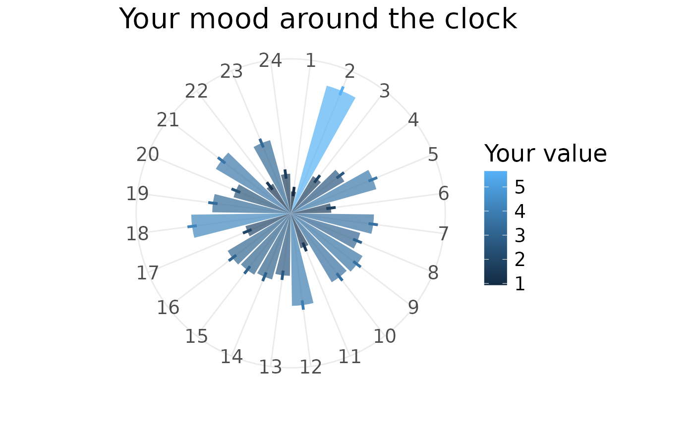
qplot_on_polar.RdPass in a data.frame with z-standardised values (x - Mean)/SD, and variable names, get a bar chart. Getting your data.frame into this shape probably will mean using tidyr + dplyr. If the data.frame has an se column or ymax/ymin columns, these will be displayed on top of the bars and the bars will become transparent.
Examples
weekdays = c("Monday","Tuesday","Wednesday","Thursday","Friday","Saturday","Sunday")
normed_data = data.frame(variable = factor(weekdays, weekdays),
  value = c(0,1,0.2,0.5,1.5,2,1)) # standardise value
qplot_on_polar(normed_data, title = "Your alcohol consumption across the week")

normed_data = data.frame(variable = factor(1:24,1:24),
  value = 3+rnorm(24), se = rep(0.2,24)) # standardise value
qplot_on_polar(normed_data, title = "Your mood around the clock")
