In our first sex diary study, we had no real budget, so we encouraged users to participate by promising them detailed feedback. This worked great1 and was well-received by participants. In the second study, we could pay participants up to 45€, but of course I wanted to one-up the feedback from the first study, given that we were using formr.org and I’m super proud of its feedback capabilities.
Specifically, I wanted to also include intra-individual feedback on menstrual cycle changes. After all, we had collected up to 70 days worth of data from each woman and asked them quite many questions. Even if the results wouldn’t always be diagnostic (there may well be cycles changes that are missed), we could at least show that. After all, many women have theories about how they personally change over the cycle.2 Most women do not explicitly track or notice ovulation.3 So, for most it is easier to notice menstrual changes rather than ovulatory changes. Our feedback might actually uncover something about them that they did not already know better themselves. I would not say this about most personality feedback based on self-report.
Decisions
When designing feedback plots that will be generated live without a human in the loop, you have to make many decisions.
- Do you require a minimum of data?
- (How) do you display uncertainty?
- Do you show the raw data?
- Which outcomes are interesting?
We pretty much free-styled these decisions. Given that my collaborators in Göttingen might run such studies again, I thought I’d show what we did and ask for reader input. We didn’t require a minimum of data, but we showed uncertainty and raw data instead. I’ve gotten the feedback from my collaborators at Clue that they would not show their users such complex plots though, so I’m very interested in simplifying them or the messages they contain.
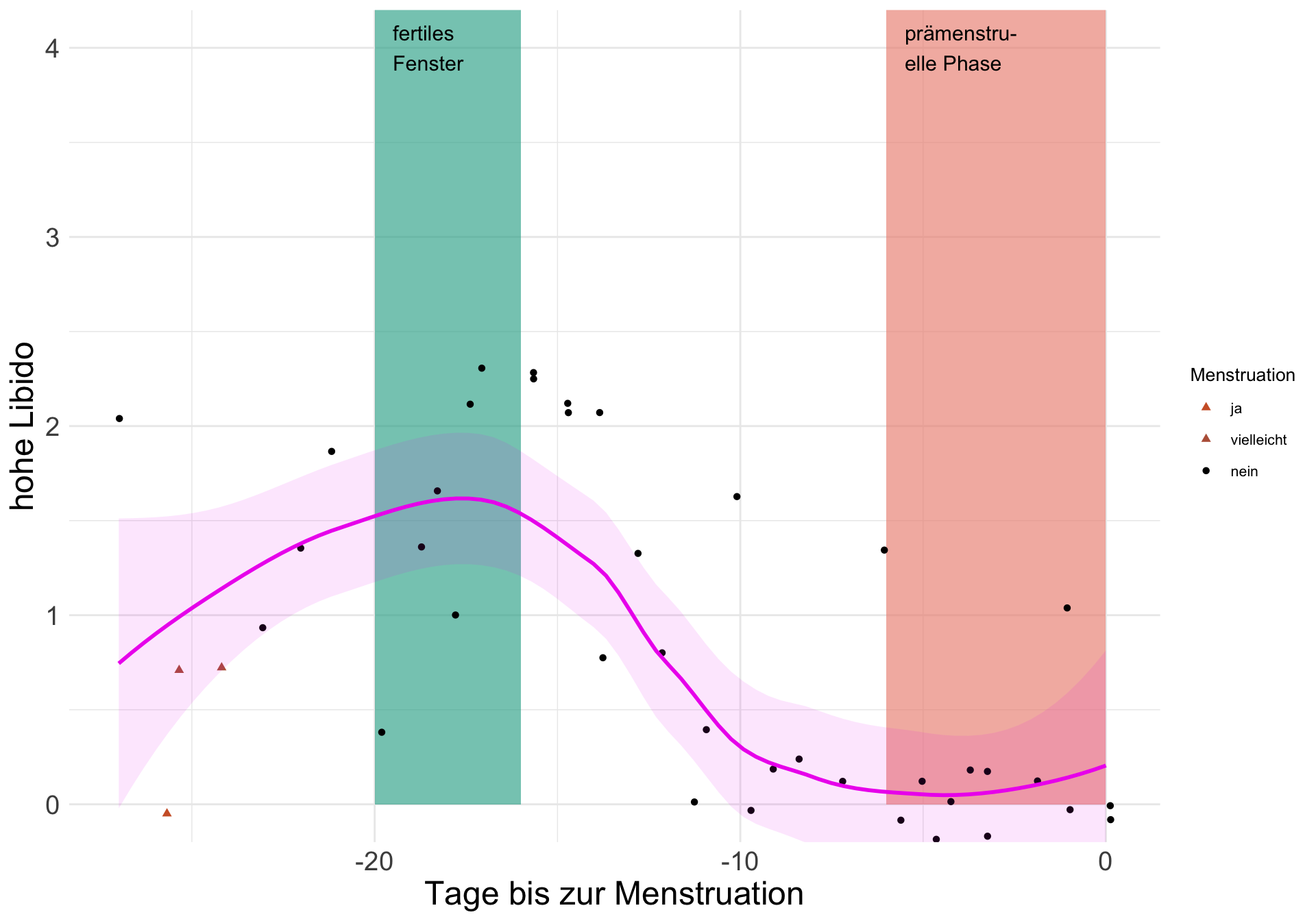
Figure 1: An example feedback plot. On the X axis you see the days until the next menstruation. On the Y axis, you see the outcome (here, high sex drive). The line is a locally weighted regression smooth with a 95% confidence interval.
Planned revisions
Of course, for many women the answers from the plots were pretty equivocal, like this plot.
- I should not have used LOESS, but a GAM with a cyclic spline
s(menstrual_onset_days_until, bs = "cc"), given that it is, you know, a cycle. I did not know that then. Thanks to Mike Lawrence for pointing this out in response to our first study’s graphs.
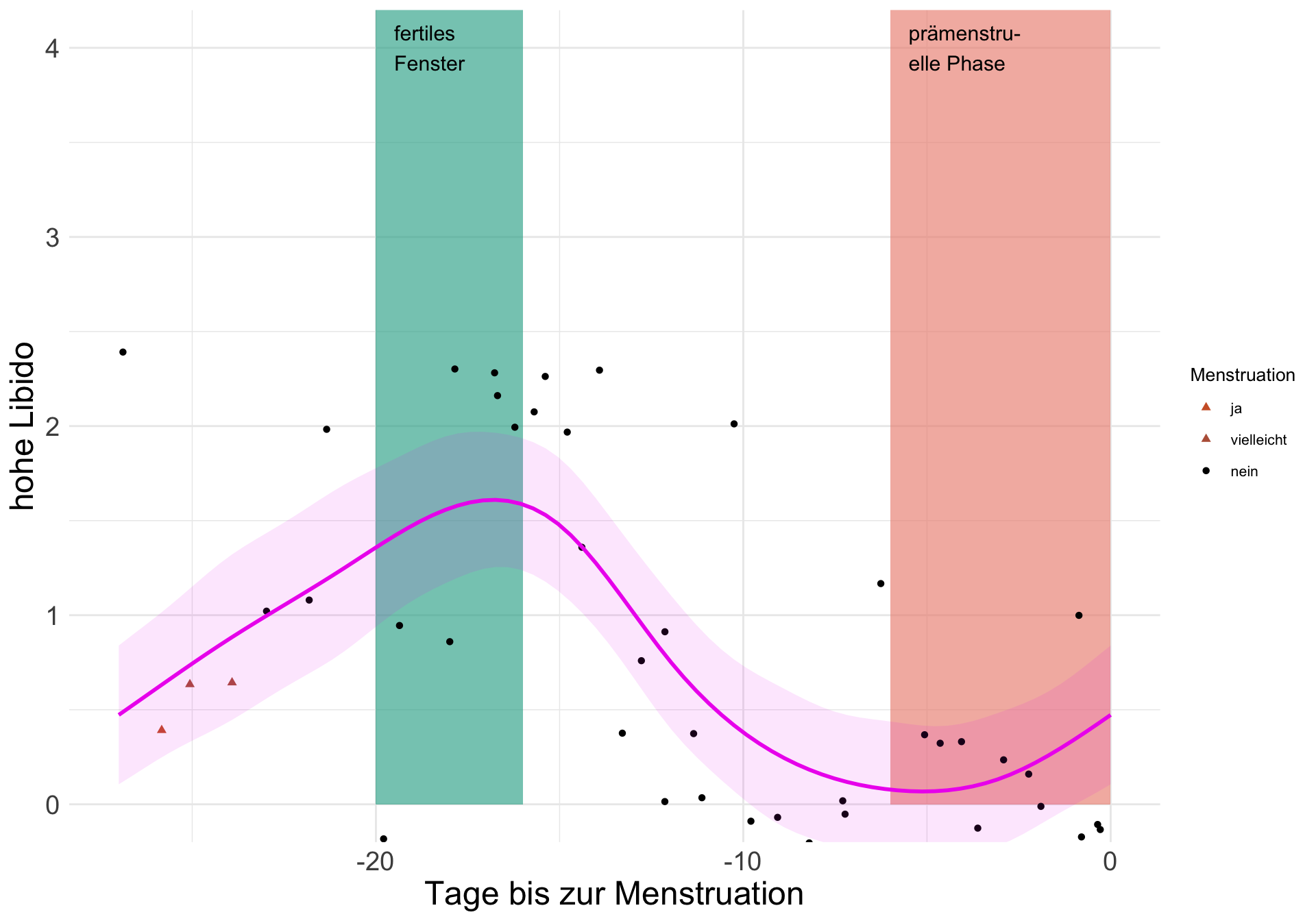
Figure 2: The same graph as above with cyclic splines.
- I should have included menstruation dates from our screening and follow-up surveys, not just the diary. I forgot or didn’t get the code working in time. This meant that some days on either side of the diary could not be included. Doing this for this participant, we get 20 days more and a clearer pattern.
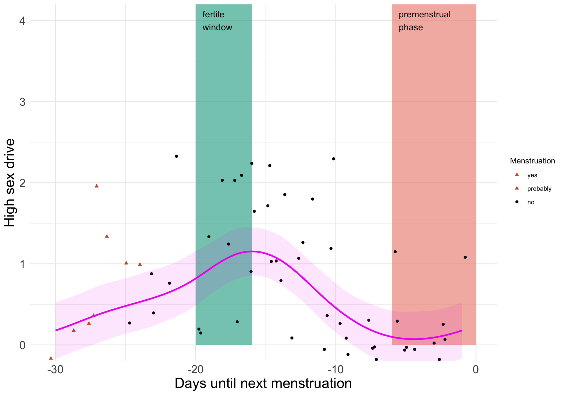
Figure 3: The same graph as above with all days included.
- I’m not happy about how we showed the fertile window. In our research work, we use a continuous measure of conception risk and of course we cannot be sure that we estimate the day of ovulation precisely with counting data. So, our precise fertile window above actually went against our own philosophy of showing uncertainty.
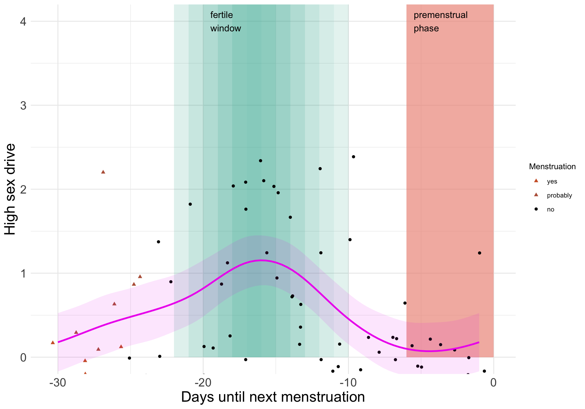
Figure 4: The same graph as above with a more continuous fertile window.
- Lastly, showing an intra-individual plot is great, but in the end, we are giving particpants something they could have found for themselves by tracking their cycle and psychological changes. And it is simply interesting to compare yourself to others.
To this end, it would have been cool to show norm data as well. We did not have such data yet because the feedback was generated live, while the study was running. Now, I can add data for other women as well. I’ll show the code for the “final” plot function here.4.
diary_comparable <- diary %>%
  group_by(session, cycle_nr) %>%
  filter(!is.na(prc_stirn_b),
         hetero_relationship == 1,
         RCD > -30, reasons_for_exclusion == "",
         between(cycle_length, 27, 30))

plot_menstruation = function(data, y, ylab, ylim = c(0, 4)) {
  if (!is.null(ylim)) {
    ymax = ylim[2]; ymin = ylim[1]
  } else {
    ymax = max(data %>% select_(y), na.rm = T)
    ymin = min(data %>% select_(y), na.rm = T)
  }
  alphas <- s3_daily %>%
    ungroup() %>%
    select(menstrual_onset_days_until, prc_stirn_b) %>%
    distinct() %>%
    filter(prc_stirn_b > 0.1) %>%
    deframe()

  rects <- alphas %>%
    imap(~ annotate('rect',
                    xmin = as.numeric(.y), xmax = as.numeric(.y) + 1,
                    ymin = ymin, ymax = ymax + 1,
                    fill = '#37af9bAA', color = NA, alpha = .x))

  ggplot(data, aes_string(x = "menstrual_onset_days_until", y = y)) +
    rects +
    annotate('rect', xmin = -6, xmax = 0,
             ymin = ymin, ymax = ymax + 1, fill = '#ed9383AA', color = NA) +
    annotate('text', label = 'fertile\nwindow', x = -19.5,
             y = ymax, size = 4, hjust = 0) +
    annotate('text', label = 'premenstrual\nphase', x = -5.5,
             y = ymax, size = 4, hjust = 0) +
    geom_jitter(aes_string(shape = "menstruation_labelled",
                           color = "menstruation_labelled"), size = 1.5) +
    scale_color_manual("Menstruation",
                       values = c("no" = "black", "probably" = "#b86147",
                                  "yes" = "#cf6030")) +
    scale_shape_manual("Menstruation",
                       values = c("no" = 16, "probably" = 17, "yes" = 17)) +
    geom_smooth(aes(group = 3), data = diary_comparable %>%
                  filter(hormonal_contraception == "FALSE"),
                method = "gam", formula = y ~ s(x, bs = 'cc'),
                color = "red", fill = "red", alpha = 0.1) +
    geom_smooth(aes(group = 2), data = diary_comparable %>%
                  filter(estrogen_progestogen == "progestogen_and_estrogen"),
                method = "gam", formula = y ~ s(x, bs = 'cc'),
                color = "black", fill = "black", alpha = 0.1) +
    geom_smooth(aes(group = 1),
                method = "gam", formula = y ~ s(x, bs = 'cc'),
                color = "#ee00ee", fill = "#ee00ee", alpha = 0.1) +
    ylab(ylab) +
    xlab("Days until next menstruation") +
    theme(legend.title = element_text(size = 10),
          legend.text = element_text(size = 8)) +
    coord_cartesian(ylim = ylim)
}
plot_menstruation(s3_daily, "high_libido", "High sex drive")
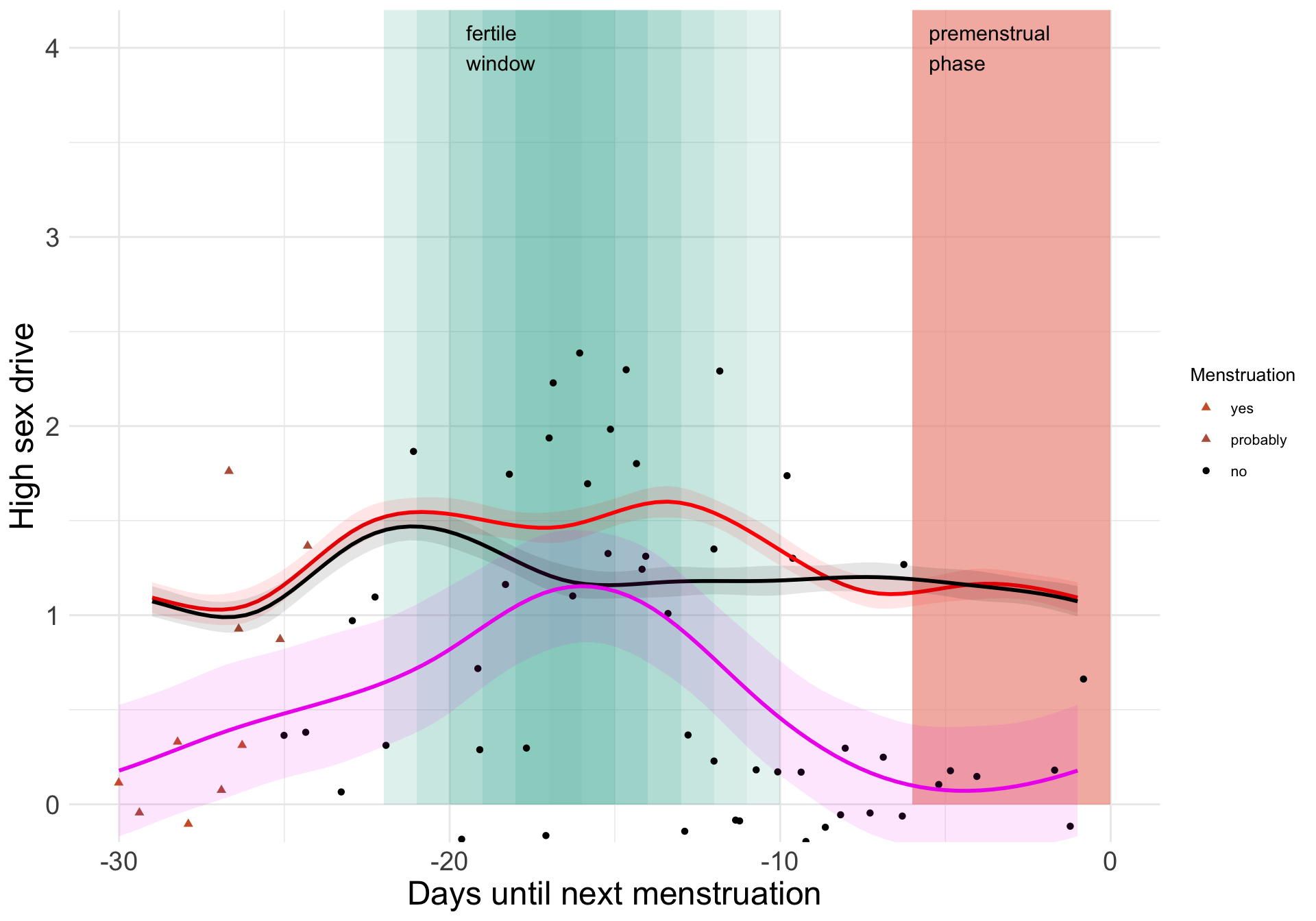
Figure 5: The same graph as above with the average curves. The black curve shows women who use combined hormonal contraceptives. The red curve shows women who don’t use hormonal contraception.
As you can see, this woman, whether by chance or because of meaningful individual differences5, seems to show a larger-than-average increase in libido in the fertile window.
Summary
The last graph does a better job than the original. It shows the uncertainty for the participant (including the fertile window estimate), includes more of their data, uses cyclic splines, and shows the normative pattern.
I’m sure it could still be improved. For example, the splines for the rest of the sample ignore the multilevel structure of the data. I have fit models with brms that could do a better job of this, but I’ll save those for another day. Do you have any other suggestions?
More feedback
I didn’t want to bore my audience too much, but if anyone is curious and doesn’t mind reading German, I uploaded an example of a full feedback for this participant. It includes personality feedback, notes on how to interpret the cycle graphs, and several interactive graphs (on time use on weekends versus weekdays, and on mood across the period of the entire diary). You can find the code here. I did not share the data to protect participant privacy, but it may still be useful if you want to make your own feedback plots.
Ok, we didn’t randomise this, so I don’t actually know whether it wasn’t something else - we really went all-in on recruiting too.↩︎
We asked about these theories after the diary concluded, but that is a story for another day.↩︎
With the exception of the large minority, ca. 30%, of women who experience mittelschmerz, or ovulation pain.↩︎
You can find the intermediate steps on Github.↩︎
I plan to rigorously test such questions soon.↩︎